le sserafim reboot

Le Sserafim is a K-pop group, and I decided to give them a visual re-branding because I love their music. This is only fan art. I am not affiliated with the group or their parent company.

Ideation

Marketing Collateral

Diary

Order of military merit

Order of military merit

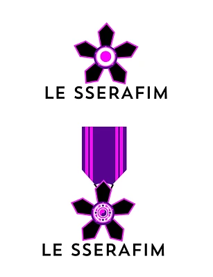
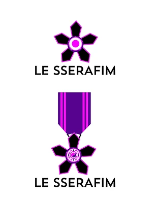
Initially, I created an angel wing logo for this group because in the Bible, the seraphim are the highest order of angels in heaven. It made sense. But then I realized this was the obvious route to take. Five thousand other graphic designers would do the same thing. You cannot get anywhere in graphic design by doing the obvious. “Le Sserafim” is an anagram for “I’m fearless.” So, I asked myself what is a symbol that could convey the idea of fearlessness? After some searching, I found the Korean Order of Military Merit awarded for bravery and valor in combat missions. It also reads as a flower or a star which represents Le Sserafim’s feminine identity. Moreover, since this medal originates from the Korean military, it visually ties them back to their native country. As soon as I made the black and white mock-up, I knew this was the one.

Illuminated manuscripts 

Illuminated manuscripts 

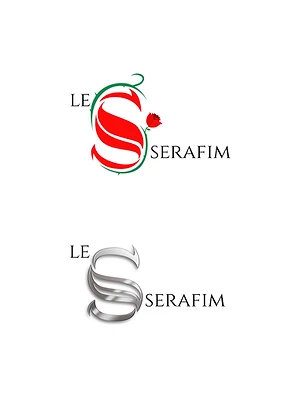
After I made the medal design, I still wanted to pursue the angel idea. But I didn’t want to use wings and a halo. So, I started thinking about symbols that could represent angels. Then I thought well, angels appear in many places in the Bible, and before the printing press, we had illuminated manuscripts. That’s when it hit me: I could give them an illuminated ‘L’ or ‘S.’ The ‘S’ resembles an abstract serpent or dragon. The small rose on the right balances the bright red in the letter, and the thorns echo the edginess in some of their music. It was a strong contender for me, but ultimately, I chose the medal design.